Best Font Size For Resume To Use
Dec 12 2016
When you’re writing a resume, style matters as well as substance. Choosing the right font, the proper format, and the correct resume font size is equally as important as the set of skills you’re about to pitch to your potential employer.
To make a positive impression and stand out from various other applicants, you must strive to be creative without going overboard. To truly let your individual skills shine, it’s crucial that you draft a professional resume that not only catches the fancy of the HR but also keeps them engaged in reading more.
So, how do to choose the best font, size, and format of your resume?
Choosing the right font and size: tips and how-to’s
As there are hundreds of fonts available, picking the correct one for your resume font size. As it so happens, most job seekers tend to prefer serif fonts that come with minimalistic decoding markings and tails like Times New Roman or perhaps a sans-serif variety like Arial.
No matter what font you decide to go with, just be sure that the resume typeface is easy on the eyes and looks good both on screen and in print regardless of formatting or size. It’s also a good idea to ditch Comic Sans fonts, colors, and other varieties that are only likely to distract the recruiter.
Another reason why you shouldn’t get too creative while using fonts is that many applications are initially read by tracking systems and not people. This implies that machines may skip vital details in unorthodox fonts, thus causing you to miss your chance at getting the job.
***
Best Resume Fonts
***
So you’ve already understood how important formatting of the resume is. And if you think that using the good old Times New Roman is the best font for resume – oh dear, unfortunately, you are mistaken. The thing is, that Times New Roman itself is great BUT it is so widely used everywhere that it looks too usual, too predictable and… kind of a boring one. And of course you don’t want to get lost among all these hundreds of similar TNR-fans, right? You won’t be if you look through top-5 best resume font size. Here we go.
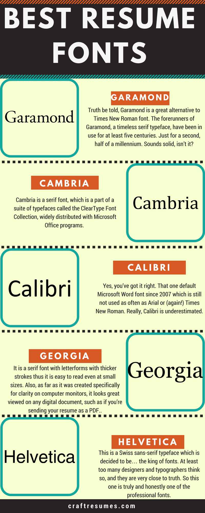
Best fonts according to job types
Basic book print fonts like Calibri, Verdana, Arial, and Times New Roman work well for all kinds of jobs. However, there is a slight margin of flexibility involved if you’re applying for a position in advertising or graphic design as employers there might be open to alternative font styles.
***
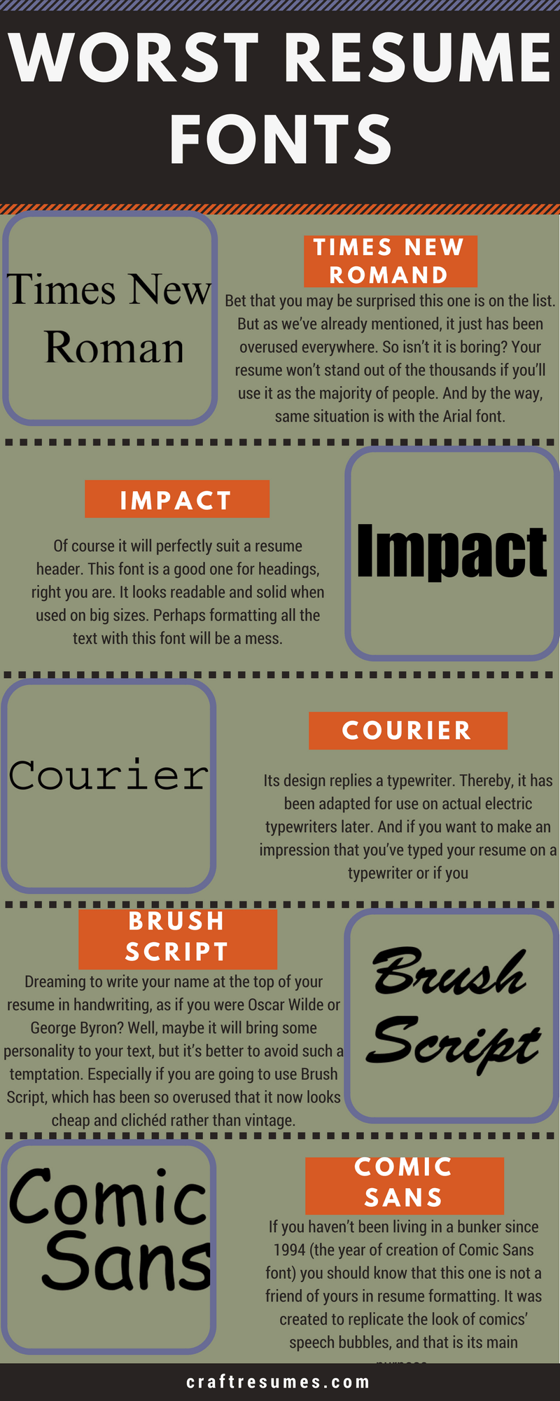
Worst Resume Fonts
***
If there is the best, there’s gonna be the worst. So, as you can understand from the subheading, here it comes. Five worst choices to make while searching a font for your resume – here they are.
Rules for combining fonts in Resume
You may say that rules are boring (as Times New Roman) and it is something from the school. But, before you will try to break them with your fresh ideas and views – learn them. Maybe something from the below will help you to cope with some issues which were unknown or difficult for you previously.
1. Choosing some extra fonts
As every human being has its personality every font has its own peculiarities, mood, and specific features. It can be casual, serious, playful, elegant, etc. So you need to be sure that so-called character of the font will match the purpose of your text. Remember the example of Comic Sans font – it’s great for phrases in bubbles of comics’ heroes but not for the serious documents.
And what about the combination of fonts – never forget to combine the opposites. There should be a contrast, but not the conflict between them. Let’s say you will have something steady and solid, Impact or any other of such kind, in the heading and, for instance, Georgia or Cambria in the main body. It’s a question of your preferences but having some sense of style is necessary for any creative process. There are plenty of pretty fonts, but if you combine them lubberly – the whole work won’t be worth any attention. Avoid mixing fonts that are too alike. And don’t abuse their number. That’s the point of how to write your resume.

2. Establishing a visual hierarchy
Have you ever noticed how the articles in newspapers and magazines look like? They all are well ordered and separated into meaningful parts, and at least look pretty cool. Same thing with the documents. Size, boldness (aka “weight”), and spacing (including leading, the space between lines, and kerning, the space between letters) – all these qualities influence the way how the eye should navigate the page and what text should attract attention first.
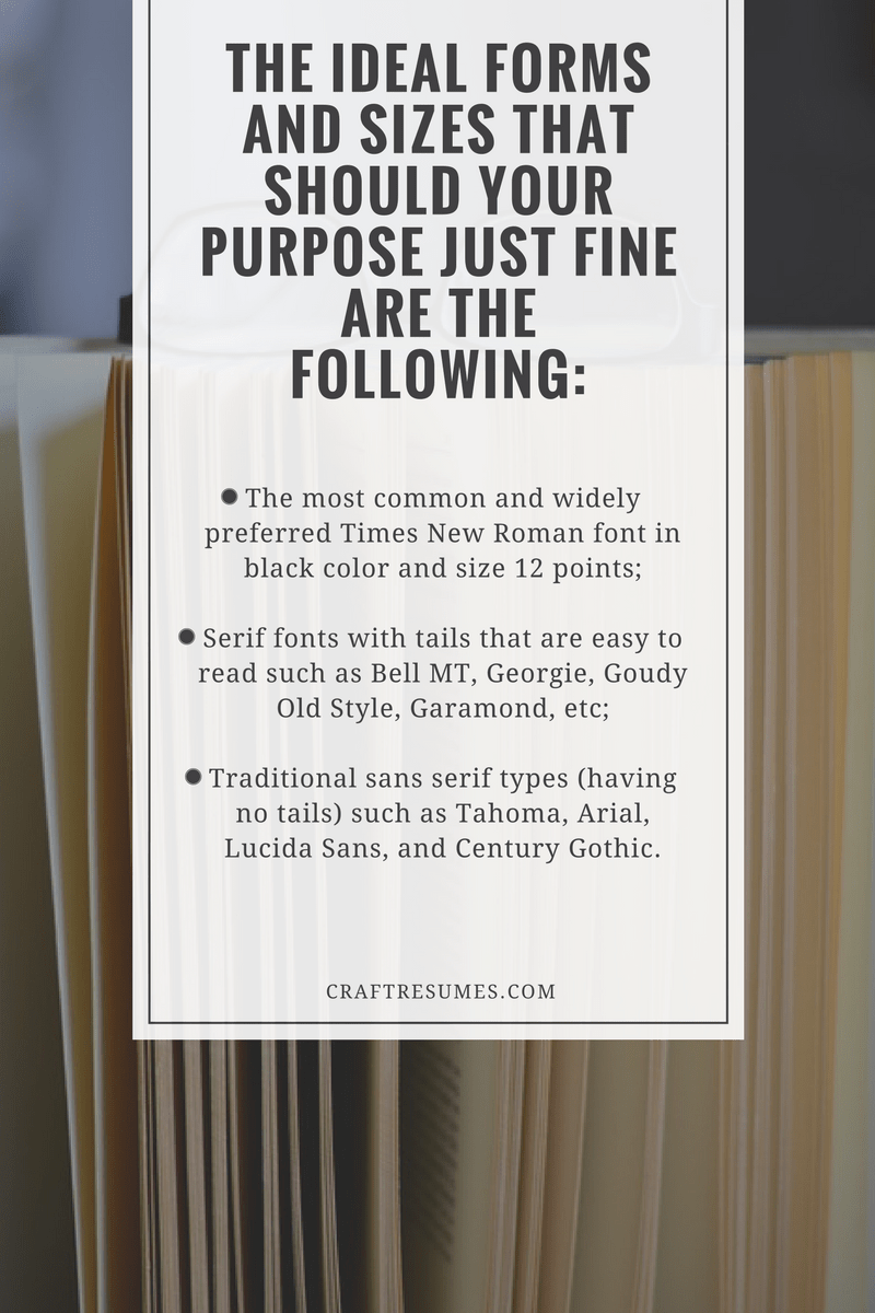
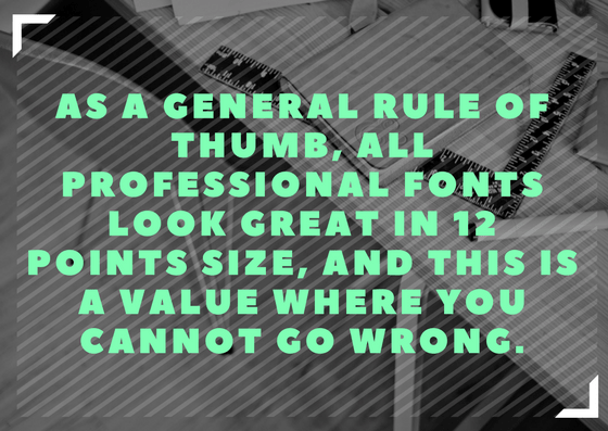
As it was already mentioned, usual requirements for font size for a resume are quite simple: black color, size 12 points (except the heading), regular markup, no more than two pages of text. Nothing special, right? That’s it.
3. Consider context
Okay, what’s next? You should decide which fonts and formatting qualities would be suitable for your project (resume, in this case, but it will work for any other kind of documents). First of all, remember about the readability of your document. At this stage some font types will fall away by themselves, hence you won’t have a necessity to choose among hundreds of them. And pay attention to resume font size in general – it should be not too big and not too small. But it seems quite clear.
4. Practice
Sometimes for some reasons many people find this step hard. But it’s not. Maybe not. It is not really a rule, more likely it’s a suggestion. All you need – some time for yourself. Everyone can improve, grow up (not literally), and become better. This is actually the whole point of everything – to improve. So, do it, if you’re not afraid.
Selecting the right resume format
Choosing the proper formatting is just as important as selecting the right font because both of these elements work in conjunction to create an impression. The idea here is to be consistent and not overuse emphasizing features like bold, italics, capitalization and underlines.
Should you choose to bold one section heading, don’t hold back from bolding them all. If you are using bullet points, and ensure they are indented in the same amount and their spacing and alignment throughout are consistent.
You can make section headers stand out a bit by bolding them, but don’t forget to maintain side margins having a standard width. You can also make the headers slightly bigger than the main text by choosing a higher value, but don’t go above and beyond 18 points.
Finishing up the resume
There is always a possibility that the hiring manager will print out a copy of your resume after reading it on the screen. So, keeping that in mind, make sure to print out a copy of the resume yourself to make sure that the font and its size looks good on paper as well.